Monday 28 January 2013

How to make a Floor Cushion...

I've just finished making a big floor cushion for Bea...of Vinnie & Bea fame ;)


I don't profess to be the best sewer in the world but I am really pleased with how it's turned out and wanted to show just how easy it is :)

  
You will need:

  • Fabric (I'd recommend something quite hard wearing like a thick heavyweight cotton, however as I am all up for recycling you could use pretty much any spare fabric)
  • Fabric scissors
  • Zip (YKK are a good brand, ideally in a colour to compliment your fabric)
  • Tailors chalk or similar
  • Tape Measure, pins and seam ripper
  • A sewing machine and coordinated sewing thread
  • An iron and ironing board

1.Start by measuring your pad inner.
**As I'm using mine as a dogs bed, I added extra filling in the form of an old sleeping bag...clean blankets and towels are also good and free!!!
Just make sure to allow for this when working out your measurements.


2.Add 2" to both the width and length for your measurements. This will allow for seam allowance.

3.Cut out 2 pieces of material, which will be the front and back of your cushion. (I used contrasting pieces of some Ikea fabric that I had spare)
**when doing anything involving fabric I like to make sure its free from creases, so keep the iron handy.


4.Lay the 2 pieces of fabric, right sides together and pin 1 of the shorter sides...this will be the side we are going to put the zip.

5.We need to center the zip onto the pinned end, so measure your zip and half the difference between this measurement and the fabric width, this will give you an equal amount of fabric each side of the zip. Using the chalk, mark where the zip will be and put the zip to one side.


6.Allowing an 1/2" seam stitch the pinned side up to your first chalk mark, do a reverse stitch and then you need to change the stitch to the longest your machine has (this is going to act as a tacking stitch and will be unpicked later) continue sewing down to just past the next chalk mark, do another reverse stitch and change back to the smaller stitch. Finish sewing to the end of the fabric..
**a shorter stitch length will give you a stronger seam. If you use a reverse stitch it gives you a secure start and finish.


7.Carefully iron open the seam you have just created.


8.Pin the zip onto the ironed out seam, using your chalk marks from earlier and with the zip situated down the crease.


9.Sew down either side of the zip, try to get as close as you can to the actual zip, if possible change the needle position. You may have to move the zipper to allow the sewing machines foot to pass.
**don't rush, keep the fabric flat and stitching on the corresponding side of fabric. (see the below diagram) Don't forget to start and finish with a reverse stitch.


View of the zip stitching on the reverse


10.Now unpick your tacking stitch using the seam ripper (if you don't have one, use some small scissors but be careful you don't want to cut your material!)


11. You should now have a concealed zip which freely open and closes. (if you wish sew across the zip stitching as below)


Now you are on the home straight...

12. Keeping the right sides together and the zip slightly open, pin the remaining 3 sides.
**I gave the fabric a quick iron as it can get creased up whilst you attach the zip.

13. Allowing a 1" seam stitch all the way around.
**I stitched a second row round the outside, just to make it super dog resistant :) you wouldn't need this for a smaller cushion.


14.Cut the 4 corners off (Don't cut your stitching) and any other excess fabric you may have. I also trimmed any stray threads.


15. Turn in the right way and your new cover is ready for the cushion inner...

Hope you found it useful xx


Tuesday 15 January 2013

Top Drawer, Pom-Poms and Decoupage

Wow, can not believe it's been so long since my last post! My course starts back next Monday so in the meantime I will fill you in on some creative projects that I've been up to.....

A friend showed me how to make tissue paper pom-poms. I made loads for my daughters 1950's themed birthday party. I have had quite a few compliments and they look so nice I might keep them up a while longer.

Tissue Paper Pom-Pom

1. Stack ten standard size sheets of tissue paper. Make 1 1/2-inch wide accordion folds, creasing with each fold on the short side.
2. Fold the paper in half to mark the halfway point and secure with a piece of floral wire or a bag tie. Unfold and tie either a piece of ribbon or thread (I used invisible thread) to the wire, this will be used to hang the pom-pom. I personally like them hanging at various heights so did mine with different lengths of thread.
3. With scissors, trim ends of tissue into rounded or pointy shapes.
4. Once secured, slightly fan out the paper and then carefully separate the layers, pulling away from centre one at a time. Don't worry if it tears you wont notice once its all done. As you carry on you should see a sphere shape forming, tweak the paper until you are happy then hang :)

Christmas Baubles

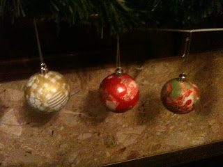
I covered some old tired baubles with some leftover decoupage papers and glue, they turned out brilliantly and cost me nothing! I bought my son a stags head can't wait to see how that turns out.
If anyone is interested in having a go at decoupaging, SewSister stock everything you need to get started :)

 
For the last couple of days I have been helping exhibit with SewSister at Top Drawer, Earls Court. We met lots of interesting people and have subsequently got some rather exciting leads to follow up. I am particularly proud of the finished stand which I helped design...giant bobbins!!!
The credit for all the other lovely things has to sit with Sue :)

Photo: Our stand at Top Drawer, Earls Court, London
 
Anyway TTFN from Vinnie & Bea

Tuesday 6 November 2012

Movember :{)

There has been a complete lack of blogging on my part, not because the ideas have dried up but the time seems to be flying by...The famous not enough hours in the day!
Have had a very creative few weeks including being inspired by Movember and the sudden obsession with moustaches :) A percentage of my handmade cards will be going towards Movember, apparently I am an official MoSista which is nice!

£2.50 each with free P&P
My course is going well, mainly because we have gained a new tutor...an Italian architect bursting with passion and enthusiasm, I have learnt more in one lesson with him than in the last month with the last tutor:

1.Drawing to scale, which is paramount when designing anything and
2.Ergonomics ( The optimising of the experience between human beings and the designed objects and environments they interact with)The word ergonomics is derived from the Greek words ergon, for work and nomos, for laws; ergonomics literally means natural laws.

This weeks homework is to sketch the dimensions of a room in our own homes..I'm being brave and my kitchen is getting it!

Also I'm going to be looking into the history of interiors as over the century, Interior Design styles have evolved in response to the changing tastes of various people groups. Popular styles of today have been born out of previous styles, from Stone Age to Contemporary.
I have enough reading and it's good to gather information from everywhere, so I've just watched George Clarkes Amazing Spaces..which was really interesting and looks at the ergonomics of small spaces from beach huts to campers and some weird and wonderful spaces..take a look if you need inspiring!


This is my mission for the weekend! Anyone else planning a spot of DIY?

Anyway between working and coursework I am still trying to plod through my own home and am now tackling the hallway.
Its still at the prep stage but I have to recommend this brill paint I've used elsewhere in the house... a white base coat that can be used on bare walls to fill small cracks and generally level it off before painting with a final colour. Cheaper and easier to use than the branded ones :)


Whilst doing the weekly dash to B&Q I noticed the magnetic paint, I've mentioned some beautiful magnetic wallpaper from designer Sian Zeng...but this would be a much cheaper alternative....  If anyone has tried it would love to know how you got on with it?

Monday 8 October 2012

The Colour Wheel & Lady Gaga


Lovely You - stitched applique badge
http://www.whatkatiedidnext.co.uk/acatalog/Badges_1.html


Such a busy week...my brain is running at a hundred miles an hour..I'm bursting with creative ideas!
My shed is getting full with projects but I just haven't had time to do any of them yet...
I have been working with the lovely What Katie Did Next and SewSister which would inspire anyone, they are lovely ladies! And are both currently working on various new products...all gorgeous and very exciting!! Plus I've been brainstorming with Sewsister to create a unique exhibition stand for a big trade show in January :)

Decoupaging Reindeer....I love my job :)


Ok, back to the course blogging.....bit of a weird one we had to create a colour wheel, bog standard stuff, well if you know it anyway! The class weren't sure and I ended up explaining to them as it turned out the tutor has never done one???? impressed? not much...although it was rather lovely when a couple of them said I would be a brilliant teacher hehe

A colour wheel helps us to understand the use of colour within painting, art, design and fashion.
Three primary colours..Red, Blue and Yellow from which you can make any other colour (secondary and tertiary)
Black and White are used for tone,black to darken and white to lighten. Then you have greyscale white at one end and black at the other and all the tones of grey in the middle.


My homework this week was to create a moodboard for Lady Gaga, which has been great fun I ordered a sample of glittery wallpaper..sooooo nice ..pity it's £55 a metre eek!


SW1 - Snow White
Glitter 'Shades of White'


It's amazing what choices you have when money isn't an option , but I'm usually looking at the cheap ranges ;)

Typography
So Cool Wall Art 'Typography' £45 per drop


P552-01 Slate
'Rugosa' Designers Guild £165 a roll


Do you know where the word "gaga" comes from??
Apparently the French painter Paul Gauguin is the source for this saying. Rumour has it that admirers loved his painting but had trouble pronouncing his name. So they shortened their admiration to saying that they were just "GAGA" Others claim that's nonsense and that the word comes from the French origin for "Fool" and so the word represents the sounds a mindless person makes.
ga·ga  (gä)
adj. Informal
1. Silly; crazy.
2. Completely absorbed, infatuated, or excited: They were gaga over the rock group's new album.
3. Senile; doddering.

Tuesday 25 September 2012

Colour Theory & Mark Making

Pretty bog standard stuff for the first class..having studied Art before I already know all about colour theory and how it relates to emotions.
Mark making has a similar effect..for example light softer marks are perceived as gentle and peaceful where as heavy, dark marks are usually associated with more aggressive emotions


They do look like scribbles, but the idea is to get you to experiment with different materials and explore how the marks create different emotions.
Think of a child learning to write and draw, this is mark making...its how we communicate with each other!


This chart sums up the main colours and what feeling they evoke, obviously there are many colours but most will fall into one of the below groups:


Personally I love greens and purples...what's your favourite colour and why?

In addition to colour, tone also plays a part...(tone is how light or dark something is)

If you feel sad, surround yourself with brighter colours
If you feel stressed or tired try surrounding yourself with pale ones

EVERYONE is affected by colour, subconsciously our brain prefers some more than others..this comes down to our personalities and how we feel at any one time

Advertising and branding are perfect examples of how colour is used to attract the right audience and capture an emotion for a product or service
Hospitals are predominately greens and blues, to promote a calm and clean environment both qualities associated with these colours.
Anything to do with children is usually bright and colourful to stimulate fun and learning

Take a look if you fancy learning more:

http://en.wikipedia.org/wiki/Color_theory

Thursday 20 September 2012

The Assistant & Shabby Chic project

whoo hoo Business cards ordered and website online...
The Assistant is now up and running!!

http://www.theassistant-surrey.co.uk/

My course finally starts on Monday and I'm expecting a fair bit of coursework plus I've got a shed load of upcycling to get on with..

I've added a couple of before and afters of some pieces i've already spruced up including a stool which I ended up selling to a happy eBayer with a profit..hardly enough to retire on but not to be sniffed at either :)


£7 Carboot


A coat of matt grey and clear varnish later..

£8 Missionary Mart

2 coats Matt White & 1 coat Matt Varnish then recovered in Vintage 1950's fabric


I would just like to say that my blog has now had nearly 300 pageviews, not bad in one week :)
So to everyone that reads my ramblings I would like to say a BIG thank you and hope that maybe next time you drop by you could leave me some comments, even if its just to say hello x

Wednesday 19 September 2012

Spineless Classics & Sian Zeng

Just a quick one today as I've been mega busy trying to set up my own little PA company, Im already working for SewSister and What Katie Did Next...so if there are any little creative businesses out there who think they could do with an extra pair of hands one day a week or even every now and then I'm your girl :) Im good with all those admin tasks but can also turn my hand to all the creative stuff too!

Anyway todays favourites for me are Spineless Classics and Sian Zeng.

Spineless classics produce these lovely posters, which are basically a whole book on one sheet! as a bit of a book worm I would love one of these, my particular favourites have to be

Moomintroll


Romeo & Juliet


Then theres this rather gorgeous magnetic wallpaper from Sian Zeng, a London based design company whose interior products have a magical and quirky charm that I love....although the range is a bit expensive for me, when I win the lottery I am so having this wallpaper :)


Magnetic woodlands wallpaper

Frog magnet...might be able to stretch to this !

Magnetic Artboard


http://www.sianzeng.com/